


Data Analytics can give us plenty of information that can be used to analyze everyday weather conditions. Knowing accurate weather conditions is an important element for individuals as well as organizations. Many businesses rely on weather conditions. It is necessary to have the correct data to get accurate decisions. One type of data that’s easier to find on the internet is Weather data. Many sites provide historical data on many meteorological parameters such as pressure, temperature, humidity, wind_speed, visibility, etc.
Terminologies: Data analytics is a discipline focused on extracting insights from data. It comprises the processes, tools, and techniques of data analysis and management, including the collection, organization, and storage of data. Meteorological Data: Data consisting of physical parameters that are measured directly by instrumentation, and include temperature, dew point, wind direction, wind speed, cloud cover, cloud layer(s), ceiling height, visibility, current weather, and precipitation amount. Apparent Temperature: Apparent temperature is the temperature equivalent perceived by humans, caused by the combined effects of air temperature, relative humidity, and wind speed. The measure is most commonly applied to the perceived outdoor temperature. Humidity: Humidity is the amount of water vapor in the air.
Objective:
The main objective is to perform data cleaning, perform analysis for testing the Influences of Global Warming on temperature and humidity, and finally put forth a conclusion. Given Hypothesis: The Null Hypothesis H0 is “Has the Apparent temperature and humidity compared monthly across 10 years of the data indicate an increase due to Global warming” The H0 means we need to find whether the average Apparent temperature for the month of a month says April starting from 2006 to 2016 and the average humidity for the same period have increased or not.
Dataset: The dataset can be obtained from Kaggle. The dataset has hourly temperature recorded for the last 10 years starting from 2006–04–01 00:00:00.000 +0200 to 2016–09–09 23:00:00.000 +0200. It corresponds to Finland, a country in Northern Europe. Source URL: kaggle.com/muthuj7/weather-dataset
Data Analysis Import Libraries We will be using several Python libraries such as Pandas, NumPy, seaborn, and matplotlib.
import numpy as np
import pandas as pd
import matplotlib.pyplot as plt
import seaborn as sns
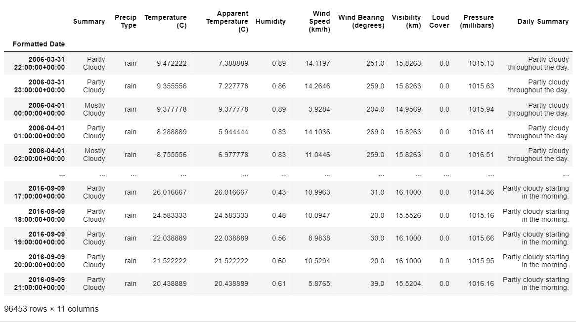
Load and Read Dataset Load the dataset using read_csv() as the dataset is in CSV form and read the first 5 rows from data using head().
data = pd.read_csv(‘weatherHistory.csv’)
data.head()
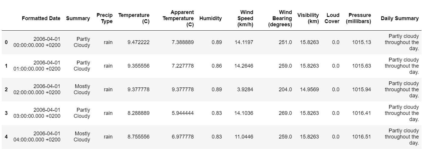
First 5 rows of the dataset
Dimensions of the data frame can be obtained using data.shape() as follows
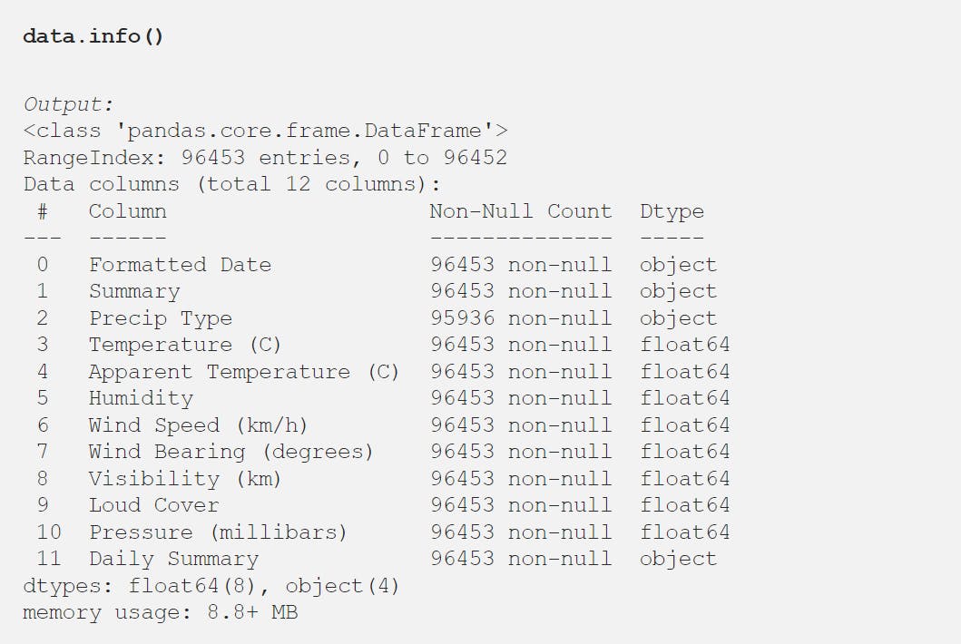
data.shape Output: (96453, 12)
The total number of rows and columns in the data set is 96453 and 12 respectively. data.info() function is used to get a concise summary of the data frame. It comes in handy when doing exploratory analysis of the data.
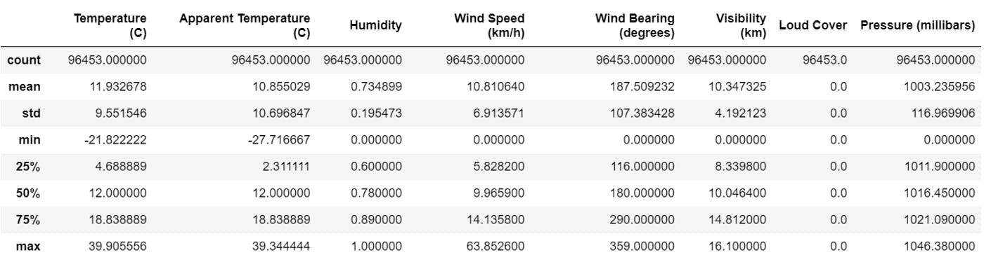
Statistical details of the data frame can be using describe() function.
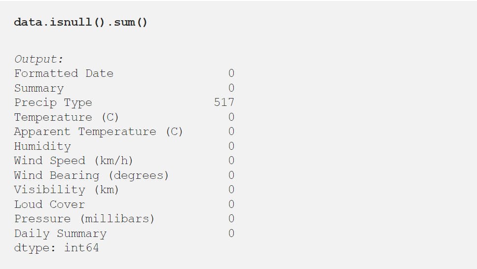
 Check for any missing values using the below function
Observation:
- In ‘Precip Type’, there are 517 missing values.
- ‘Wind Bearing (degrees)’ has only integer values
- Formatted Date is in String.
- Minimum values of Humidity, Wind Speed (km/h), Wind Bearing (degrees), Visibility (km) are Zero and they can be Zero.
- We only need 3 columns for our task which is data[‘Formatted Date’, ‘Apparent Temperature(c)’, ‘Humidity’]. So, we can ignore the missing values
The unique values of a column are obtained using the unique() function.
data['Loud Cover'].unique()
Output: array([0.])
We can remove the unwanted columns which don’t add value to the analysis using the drop() function. We will drop ‘Loud Cover’ as it has one unique value 0 and it is not useful in analysis.
data = data.drop([‘Loud Cover’], axis = 1)
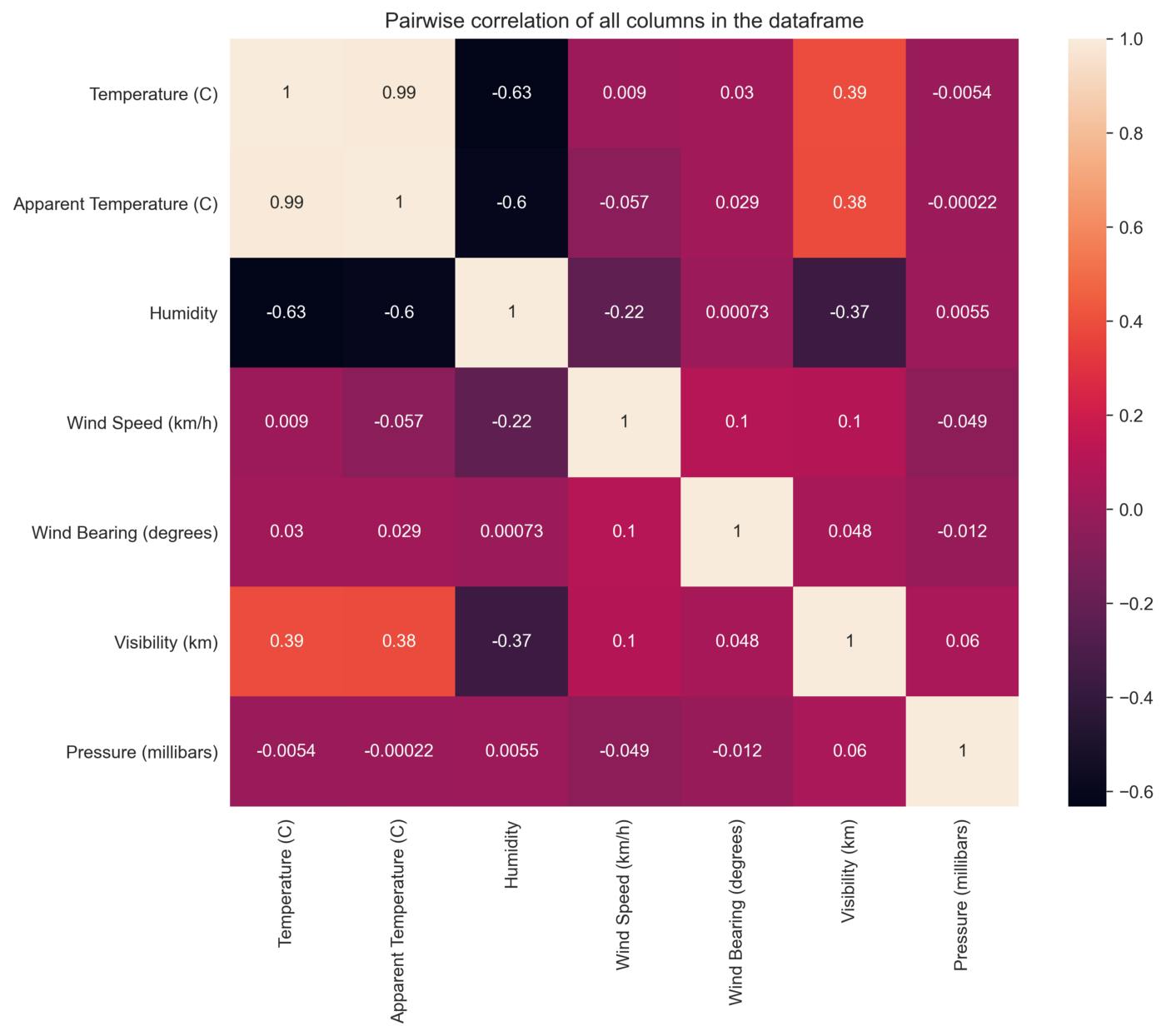
Pairwise correlation of all columns in the data frame Correlation matrices are an essential tool of exploratory data analysis. Correlation heatmaps contain the same information in a visually appealing way. We can display the pairwise correlation using corr() function which creates the correlation matrix between all the features in the dataset.
# Increase the size of the heatmap
plt.figure(figsize=(10,8))
# Store heatmap object in a variable to easily access it when you want to include more features and set the annotation to True to display the correlation values on the heatmap.
sns.heatmap(data= data.corr(), annot=True)
# Give a title to the heatmap.
plt.title(“Pairwise correlation of all columns in the dataframe”)
# save the figure
plt.savefig(‘plot6.png’, dpi=300, bbox_inches=’tight’)
plt.show()
 Change the ‘Formatted Date’ feature from String to Datetime using the datetime() function.
data[‘Formatted Date’] = pd.to_datetime(data[‘Formatted Date’],
utc=True)
We can set “Formatted Date” as an index using the set_index() function which sets the DataFrame index (row labels) using one or more existing columns.
data = data.set_index(“Formatted Date”)
data
 In the above image, we can see that the “Formatted Date” is changed to the datetime format and is set as the index of the dataset. The updated dataset has 96453 rows and 11 columns.
Resample Data : Now, we have hourly data, we need to resample it to monthly. Resampling is a convenient method for frequency conversion. The object must have a datetime like an index. We only require the Apparent Temperature and humidity columns to test the hypothesis. So, we will consider these two columns and perform a resample() function from Pandas.
df_column = ['Apparent Temperature (C)', 'Humidity']
df_monthly_mean = data[df_column].resample("MS").mean() #MS-Month Starting
df_monthly_mean.head()
The above function converts hourly data to monthly data using “MS” which denotes the Month starting. We are displaying the average apparent temperature and humidity using the mean() function.
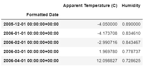 The resampled data is displayed using: df_monthly_mean.head()
This function displays the first rows of the dataset.
We will be using this dataset for testing the hypothesis.
The resampled data is displayed using: df_monthly_mean.head()
This function displays the first rows of the dataset.
We will be using this dataset for testing the hypothesis.
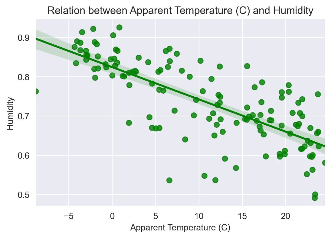
Relation between Apparent Temperature & Humidity Using Regplot We can use the regplot() function to plot the relationship between the “Apparent Temperature ” and “Humidity”.
sns.set_style("darkgrid")
sns.regplot(data=df_monthly_mean, x="Apparent Temperature (C)", y="Humidity", color="g")
plt.title("Relation between Apparent Temperature (C) and Humidity")
plt.show()
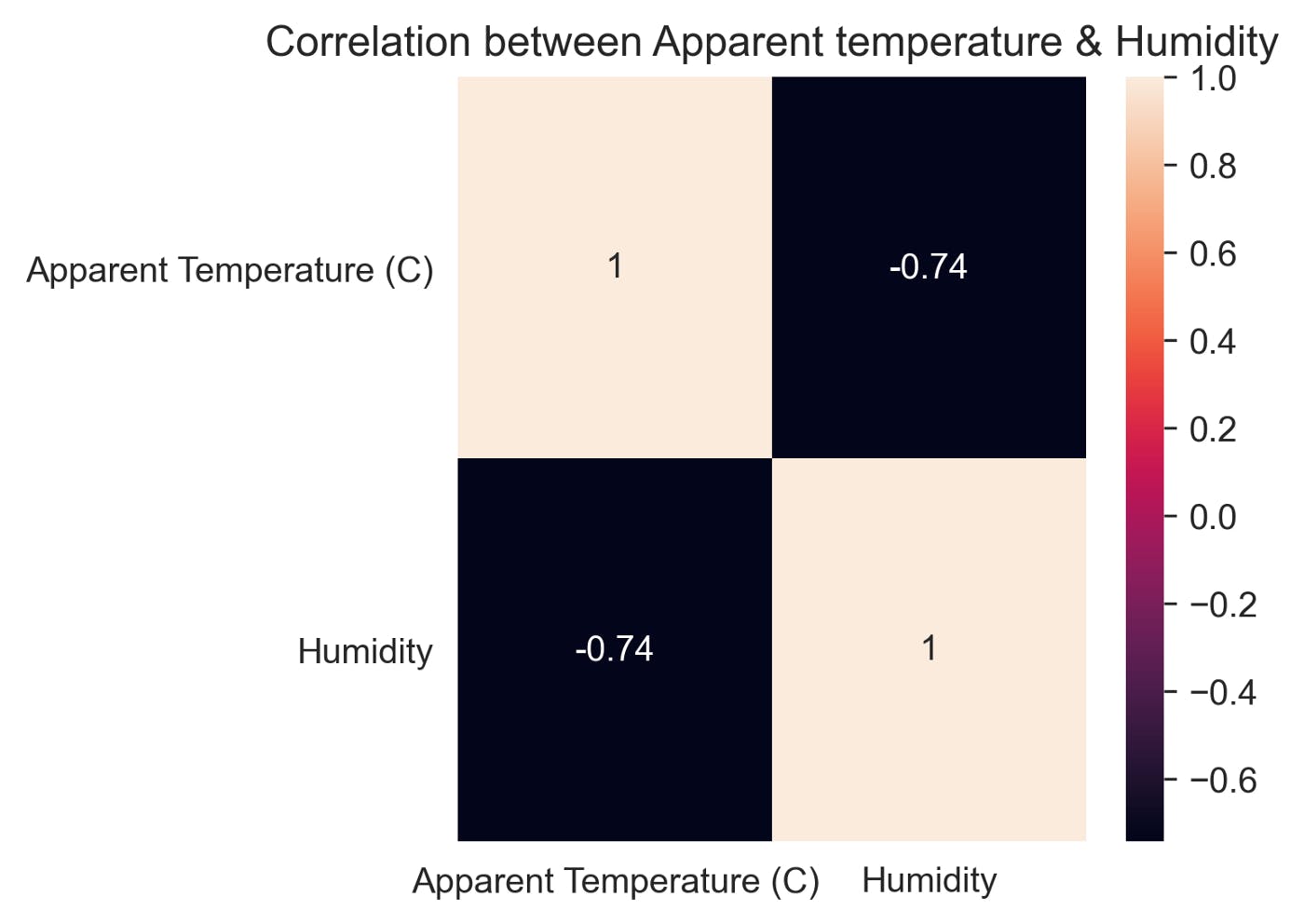
Correlation between Apparent temperature & Humidity
# Pair plot for correlation of Apparent temperature & Humidity
sns.set_style(“darkgrid”)
plt.figure(figsize=(4,4))
plt.title(“Correlation between Apparent temperature & Humidity”)
sns.heatmap(data= df_monthly_mean.corr(), annot=True)
plt.show()
Pair plot for correlation of Apparent temperature & Humidity We can use the pairplot() function to plot the correlation of the “Apparent Temperature ” and “Humidity”.
sns.pairplot(df_monthly_mean, kind='scatter')
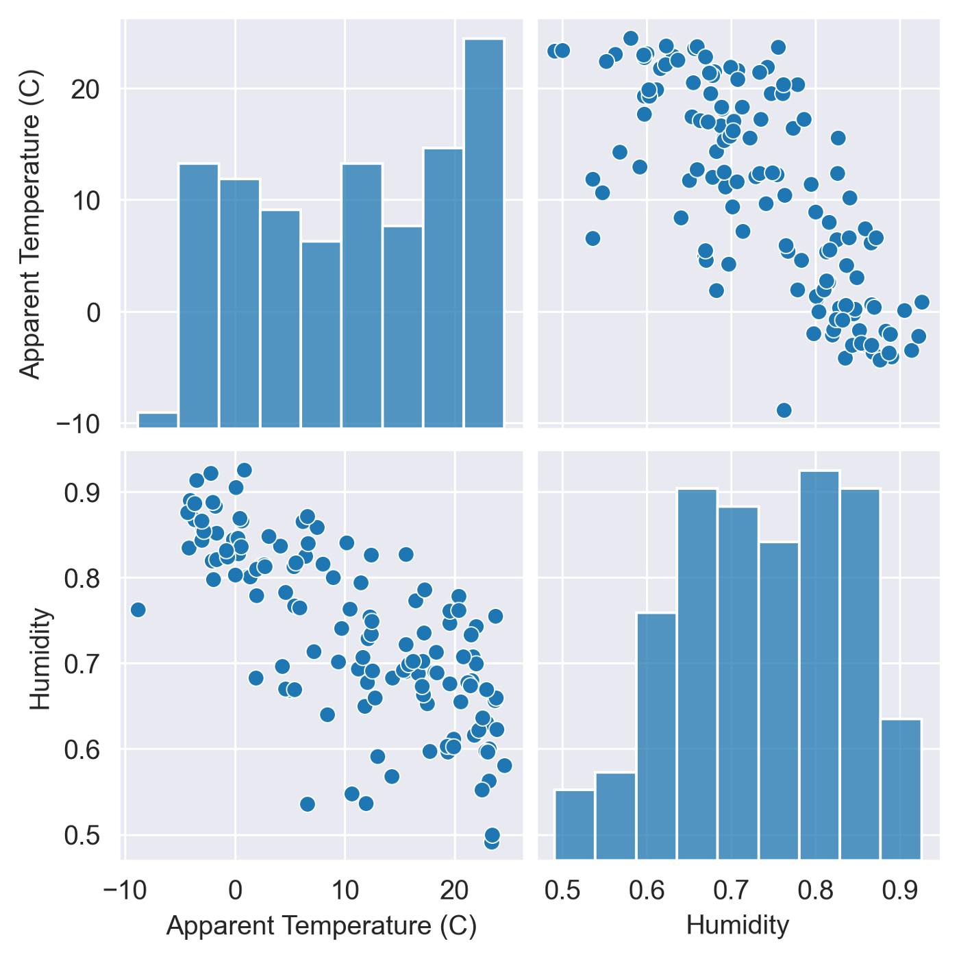
Observation: There is a Linear Relation between “Apparent Temperature ” and “Humidity” with a negative slope. As air temperature increases, air can hold more water molecules, and its relative humidity decreases. When temperatures drop, relative humidity increases. We use lineplot() function to plot the Variation of Apparent Temperature and Humidity with time.
plt.figure(figsize=(14,6))
sns.lineplot(data = df_monthly_mean)
plt.xlabel('Year')
plt.title("Variation of Apparent Temperature and Humidity with time")
plt.show()
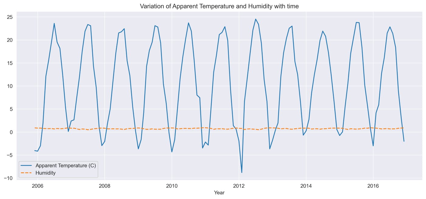
Observation: The above graph displays average temperature and humidity for all 12 months over the 10 years i.e., from 2006 to 2016. From the above plot,
- “Humidity” remained constant from 2006–2016
- “Apparent Temperature ” changed from 2006–2016 at regular intervals with constant amplitude.
2D Scatter Plot with Color Coding for each Summary type We use a FacetGrid object with a scatterplot to plot the summary types of different weather conditions to Temperature and Humidity. FacetGrid object takes a data frame as input and the names of the variables that will form the row, column, or hue dimensions of the grid. The variables should be categorical and the data at each level of the variable will be used for a facet along that axis.
sns.FacetGrid(data, hue="Summary", height=10).map(plt.scatter, "Apparent Temperature (C)", "Humidity").add_legend()
plt.title("2D Scatter Plot with Color Coding for each Summary type")
plt.show()
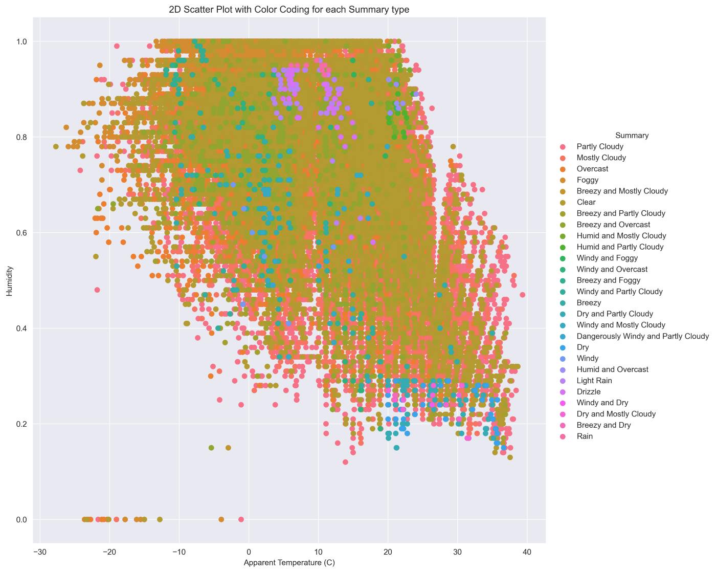
Observation:
- There are very few outliers.
- Mostly Weather is Clear or Partly Cloudy/Rainy in Finland.
- Only a few days there has a Light Rain or Dry or Dangerously Windy and Partly Cloudy.
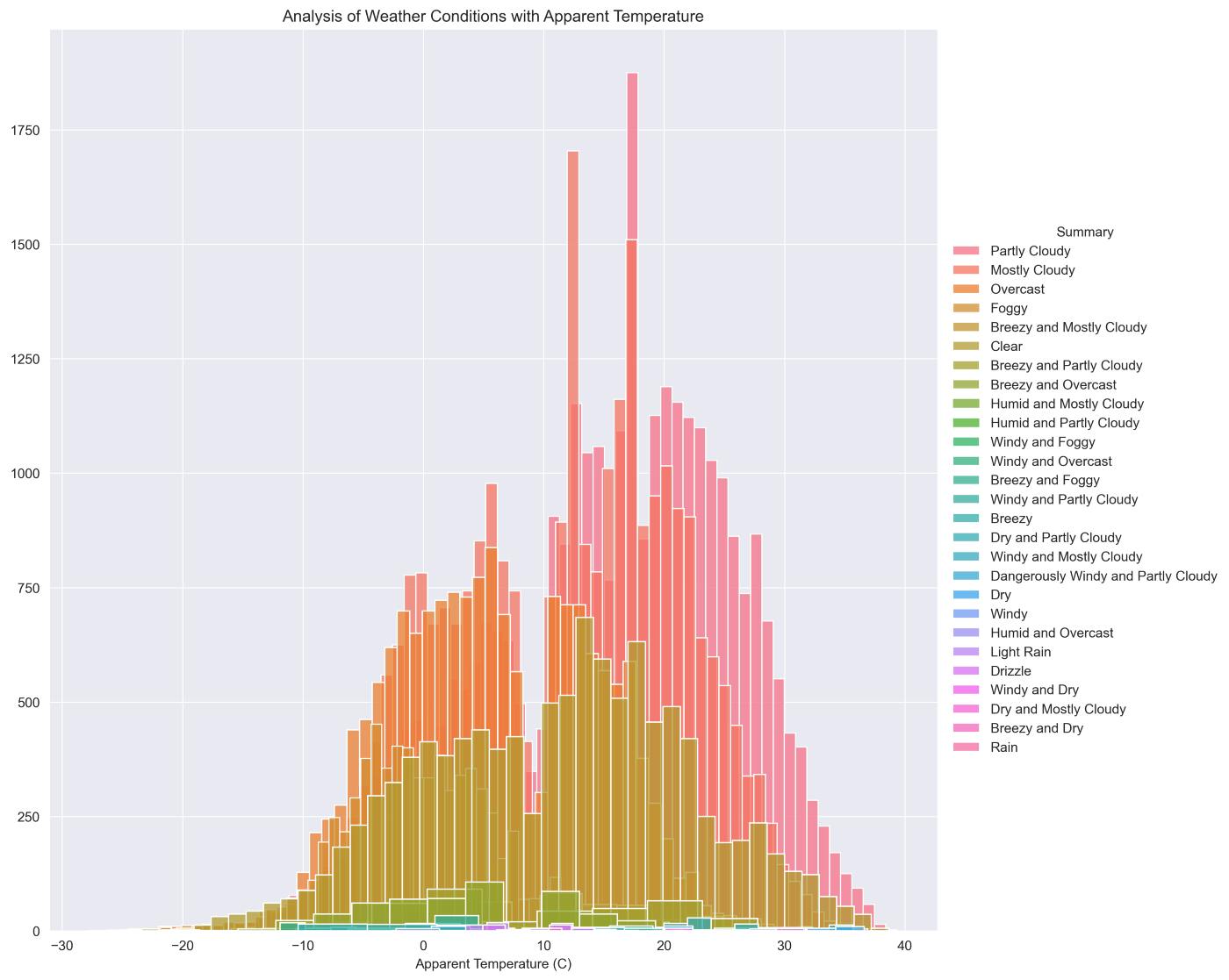
### Univariate Analysis “Uni” means one and “Variate” means variable hence univariate analysis means analysis of one variable or one feature. Univariate tells us how data in each feature is distributed. In the univariate analysis, we use histograms for analyzing and visualizing frequency distribution. Plotting histograms in pandas is very easy and straightforward. Univariate Analysis For Apparent Temperature :
sns.FacetGrid(data, hue="Summary", height=10).map(sns.histplot, "Apparent Temperature (C)").add_legend()
plt.title("Analysis of Weather Conditions with Apparent Temperature")
plt.show()
Univariate Analysis For Humidity:
sns.FacetGrid(data, hue="Summary",height=10).map(sns.histplot, "Humidity").add_legend()
plt.title("Analysis of Weather Conditions with Humidity")
plt.show()
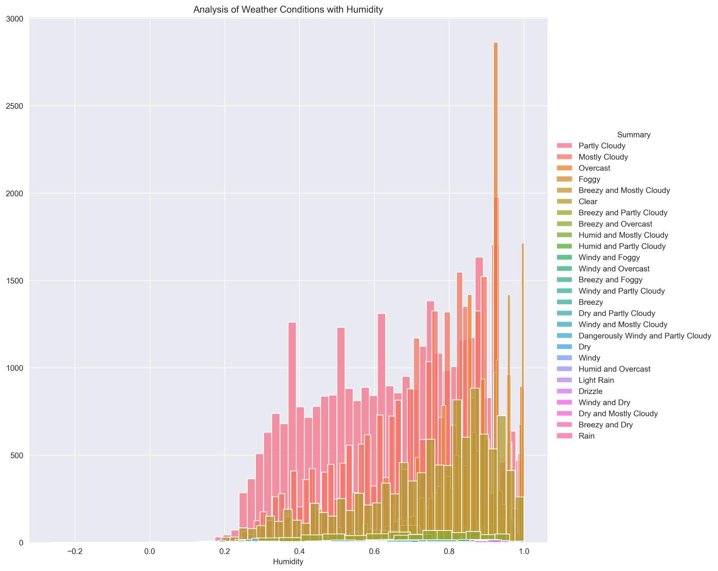
Observation: “Humidity” is a better Feature than “Apparent Temperature ”
Function for plotting Humidity & Apparent Temperature for all months
TEMP_DATA = df_monthly_mean.iloc[:,0]
HUM_DATA = df_monthly_mean.iloc[:,1]
def label_color(month):
    if month == 1:
        return 'January','blue'
    elif month == 2:
        return 'February','green'
    elif month == 3:
        return 'March','orange'
    elif month == 4:
        return 'April','yellow'
    elif month == 5:
        return 'May','red'
    elif month == 6:
        return 'June','violet'
    elif month == 7:
        return 'July','purple'
    elif month == 8:
        return 'August','black'
    elif month == 9:
        return 'September','brown'
    elif month == 10:
        return 'October','darkblue'
    elif month == 11:
        return 'November','grey'
    else:
        return 'December','pink'
def plot_month(month, data):
    label, color = label_color(month)
    mdata = data[data.index.month == month]
    sns.lineplot(data=mdata,label=label,color=color,marker='o')

def sns_plot(title, data):
    plt.figure(figsize=(14,8))
    plt.title(title)
    plt.xlabel('YEAR')
    for i in range(1,13):
        plot_month(i,data)
    plt.show()
This function helps to analyze the variations in Apparent Temperature and Humidity for all months over the 10 years.
title = 'Month-wise Plot for Apparent Temperature of 10 years'
sns_plot(title, TEMP_DATA)
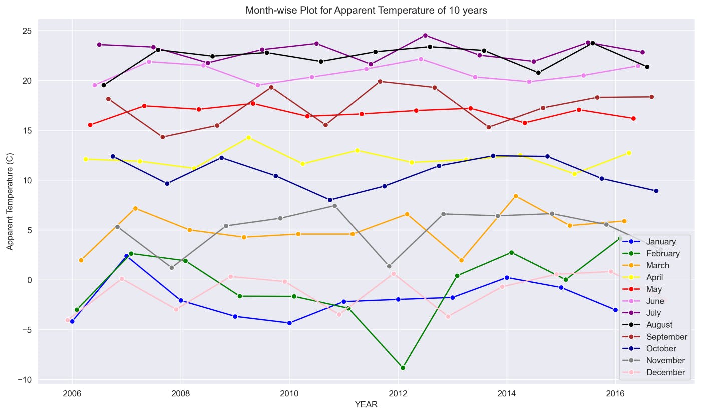
This graph shows the changes in Temperature for each month from 2006 to 2016.
title = 'Month-wise Plot for Humidity of 10 years'
sns_plot(title, HUM_DATA)
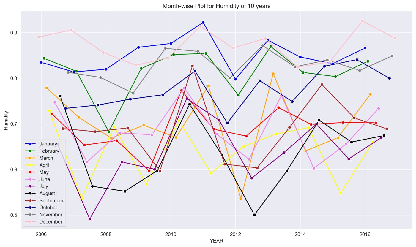
This graph shows the changes in Humidity for each month from 2006 to 2016.
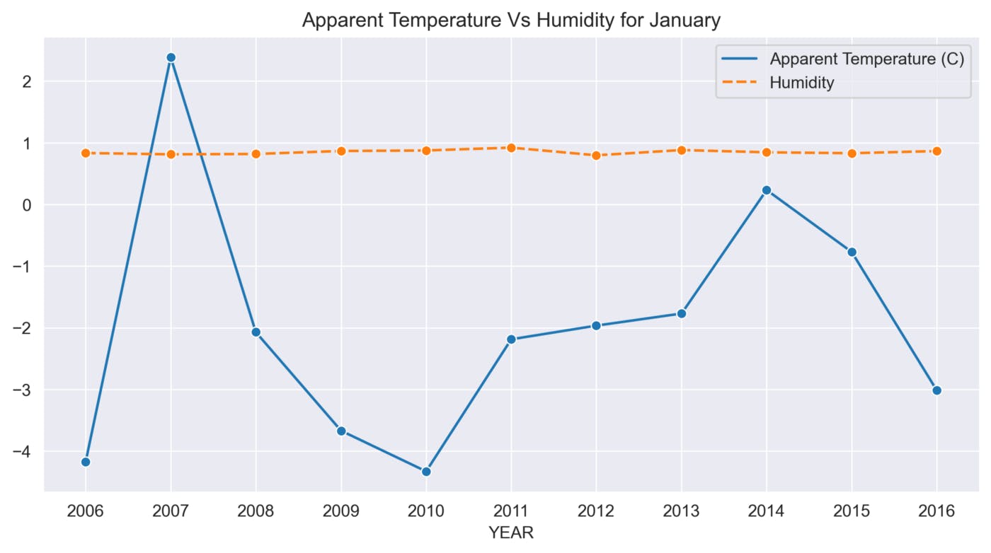
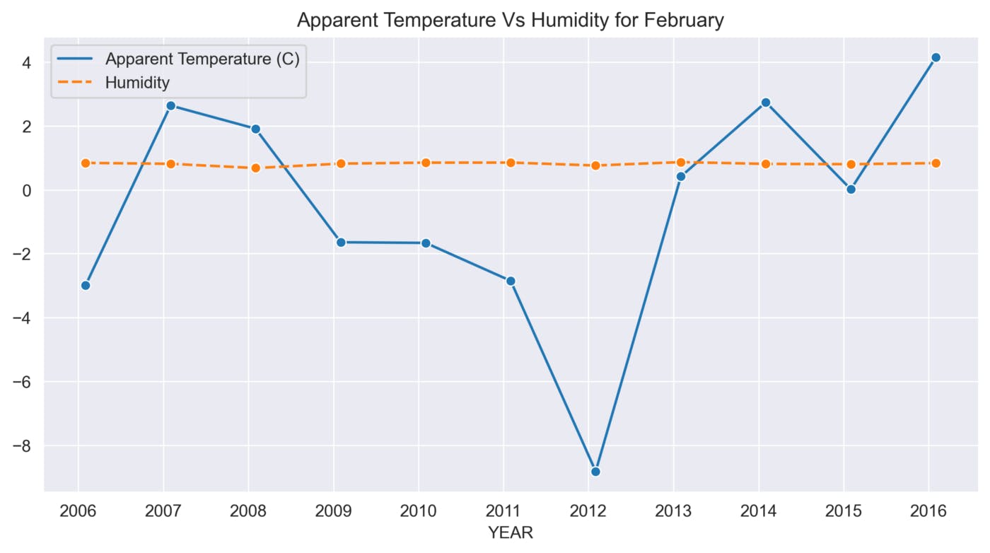
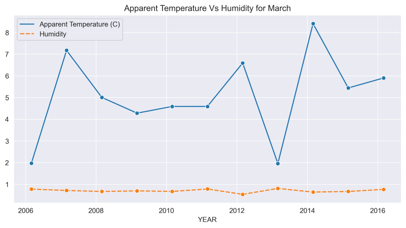
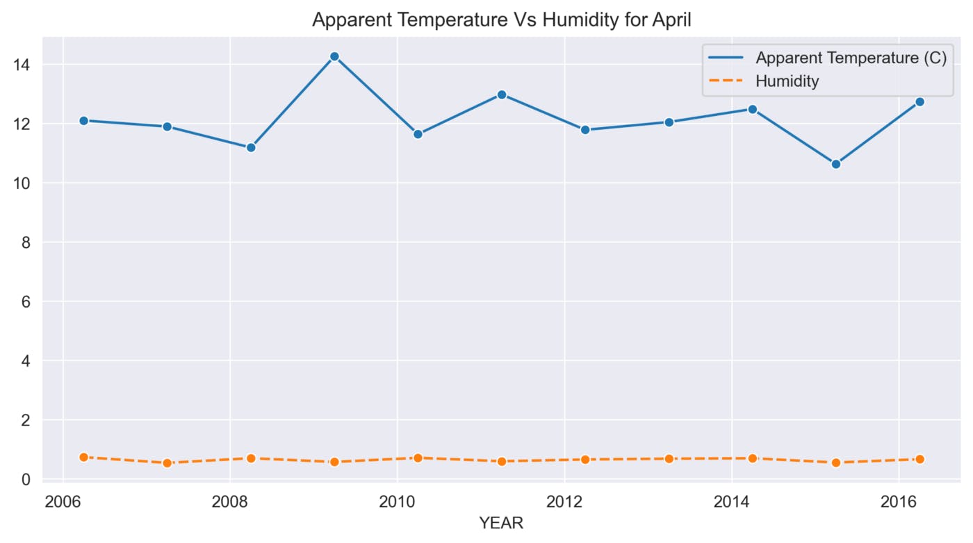
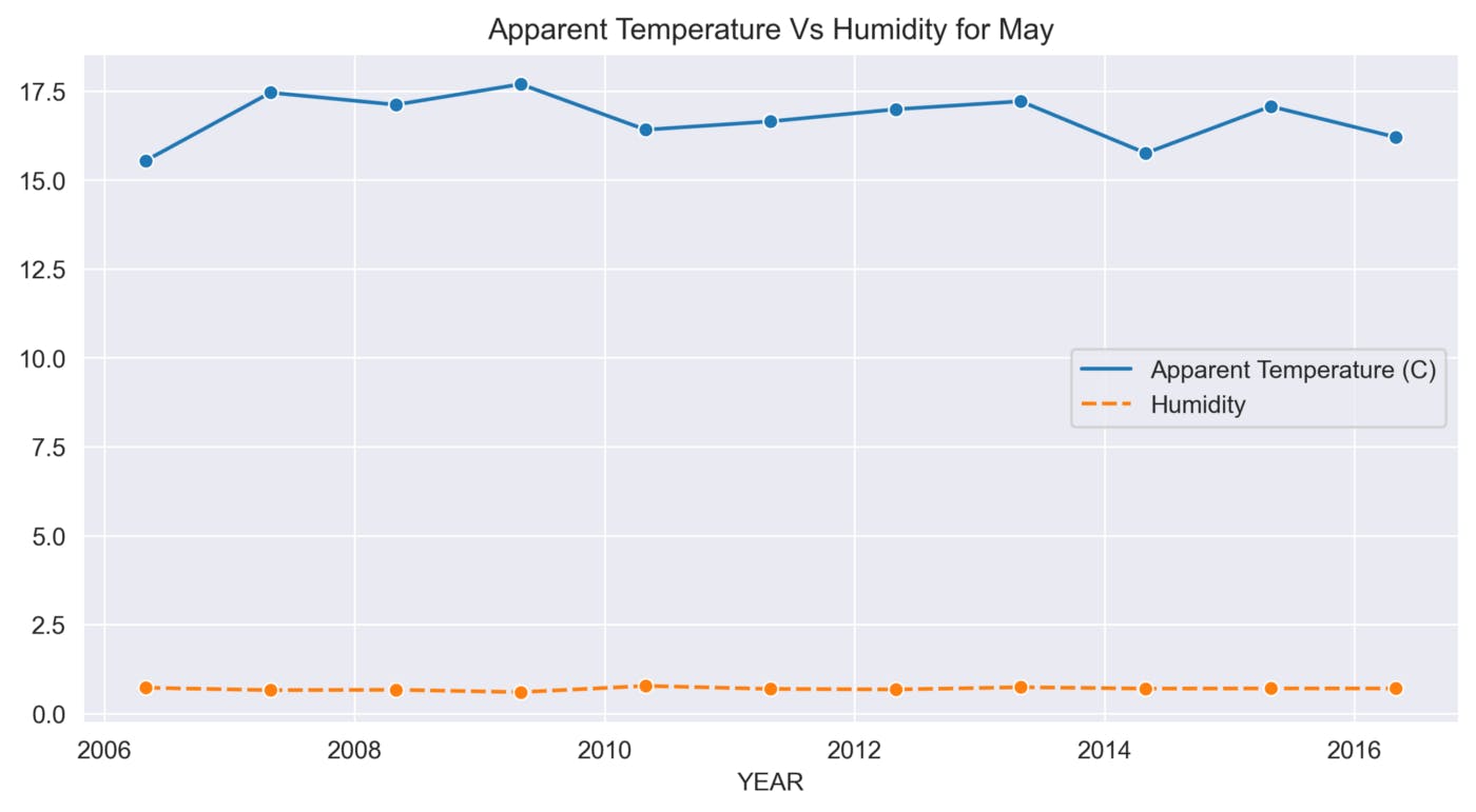
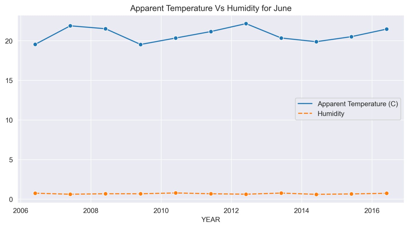
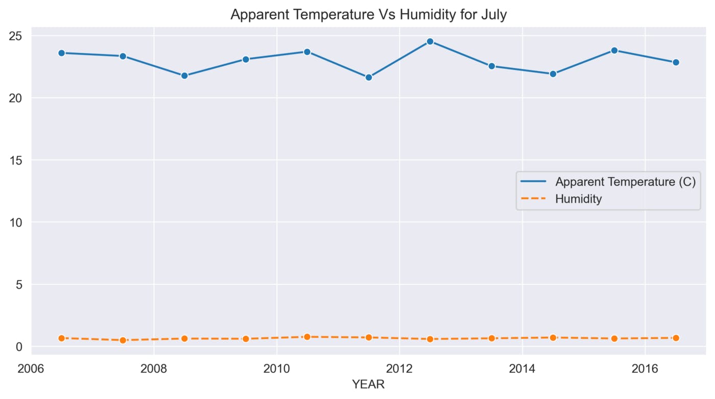
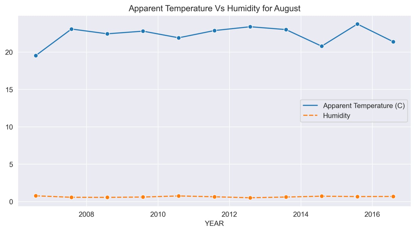
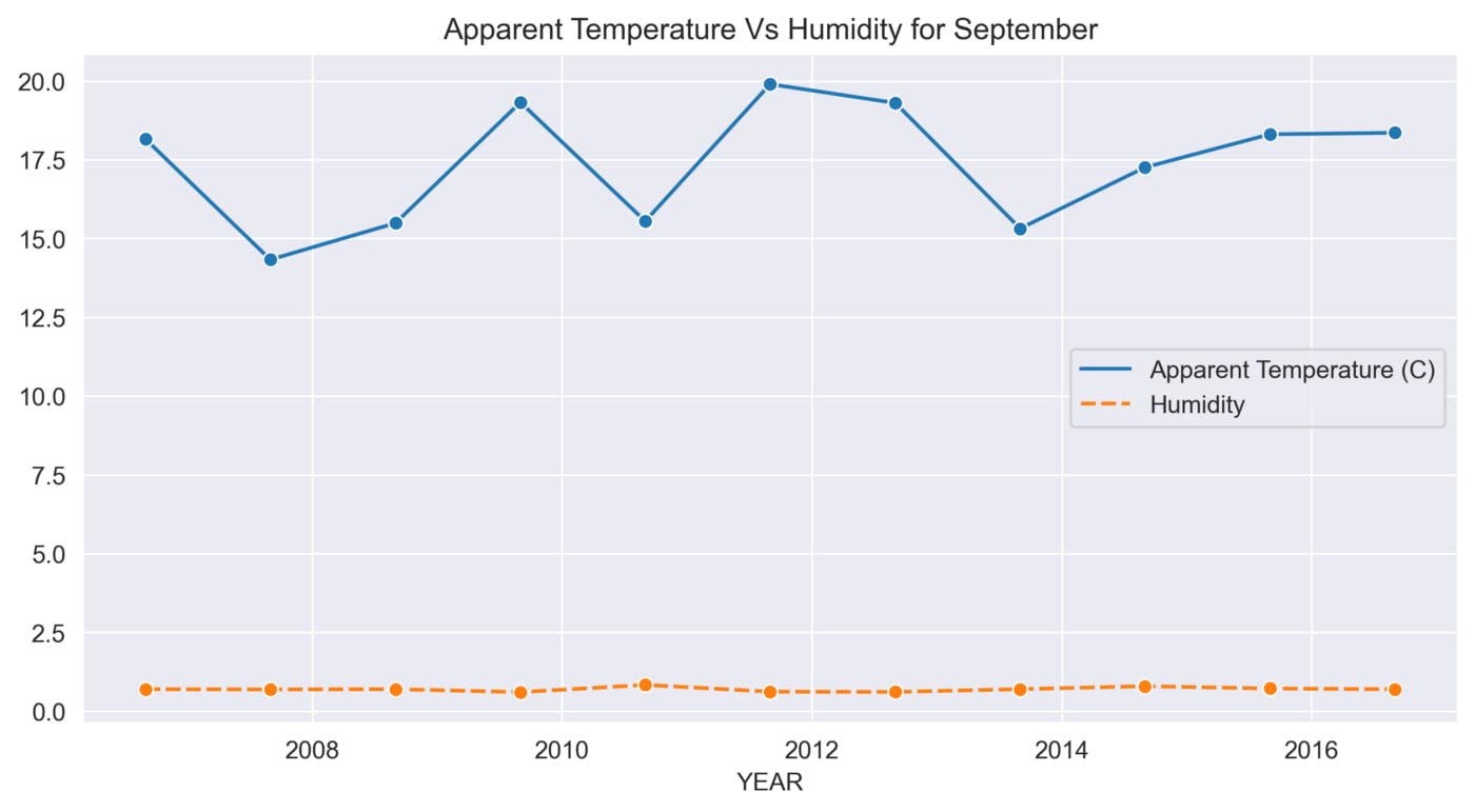
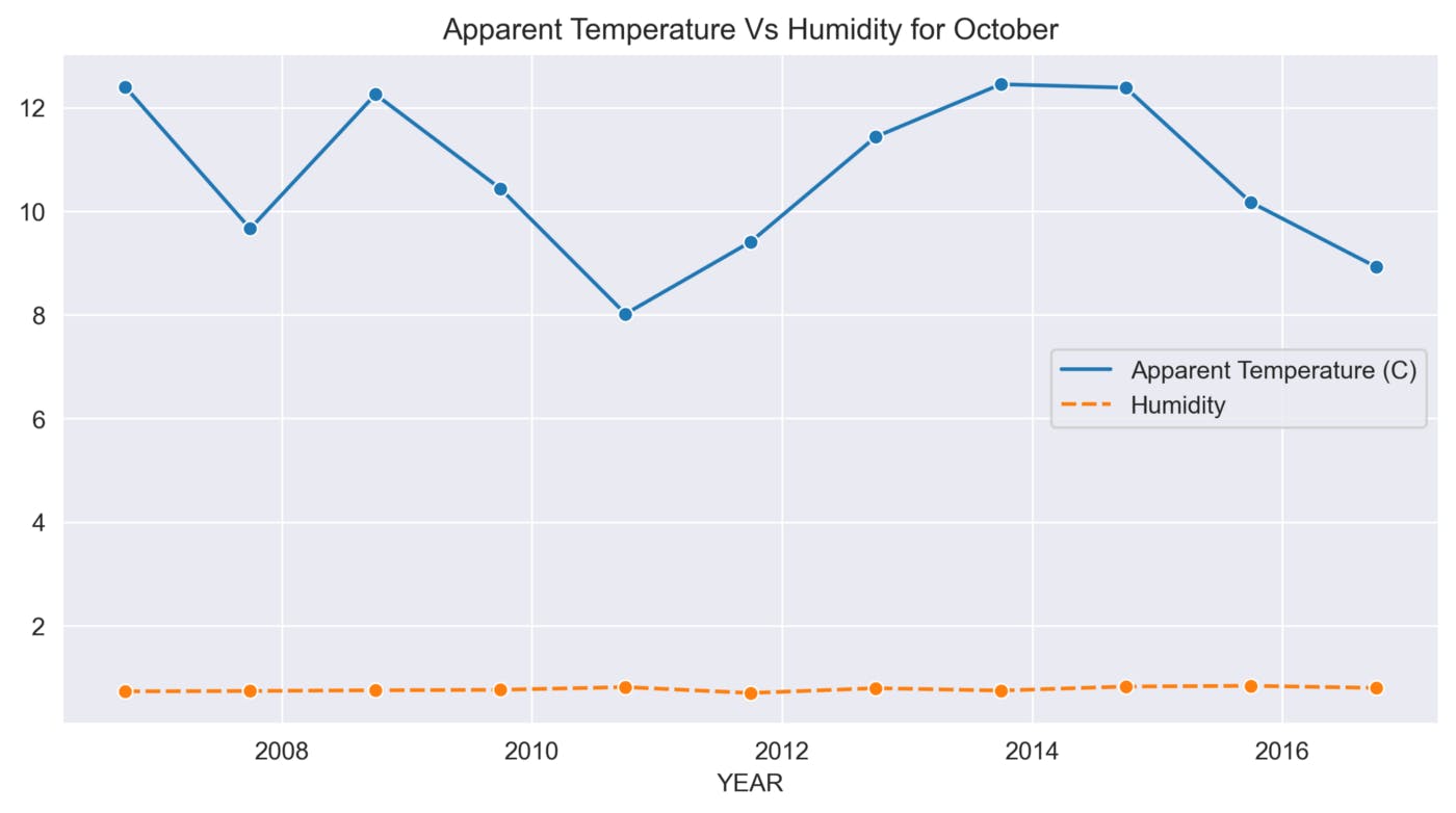
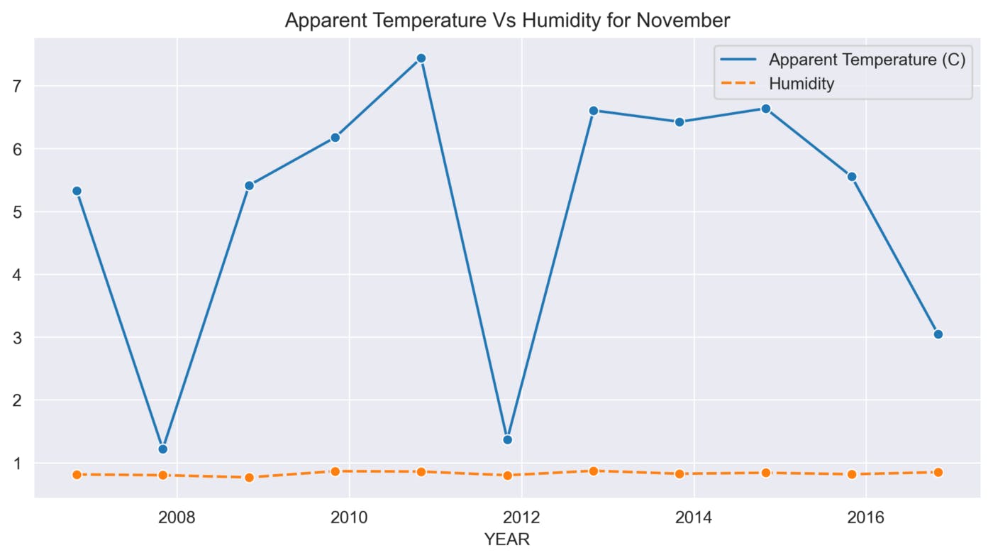
### Function for plotting Humidity & Apparent Temperature for each month
def sns_month_plot(month):
    plt.figure(figsize=(10,5))
    label = label_color(month)[0]
    plt.title('Apparent Temperature Vs Humidity for {}'.format(label))
    plt.xlabel('YEAR')
    data = df_monthly_mean[df_monthly_mean.index.month == month]
    sns.lineplot(data=data, marker='o')
    name="month"+str(month)+".png"
    plt.savefig(name, dpi=300, bbox_inches='tight')
    plt.show()
    print('-'*80)
# plot for the month of JANUARY - DECEMBER
for month in range(1,13):
    sns_month_plot(month)
This function helps to analyze the variations in Apparent Temperature and Humidity for each month over the 10 years. The graphs below show the variations in Apparent Temperature and Humidity for each month from 2006 to 2016.
January
February
March
April
May
June
July
August
September
October
November
December
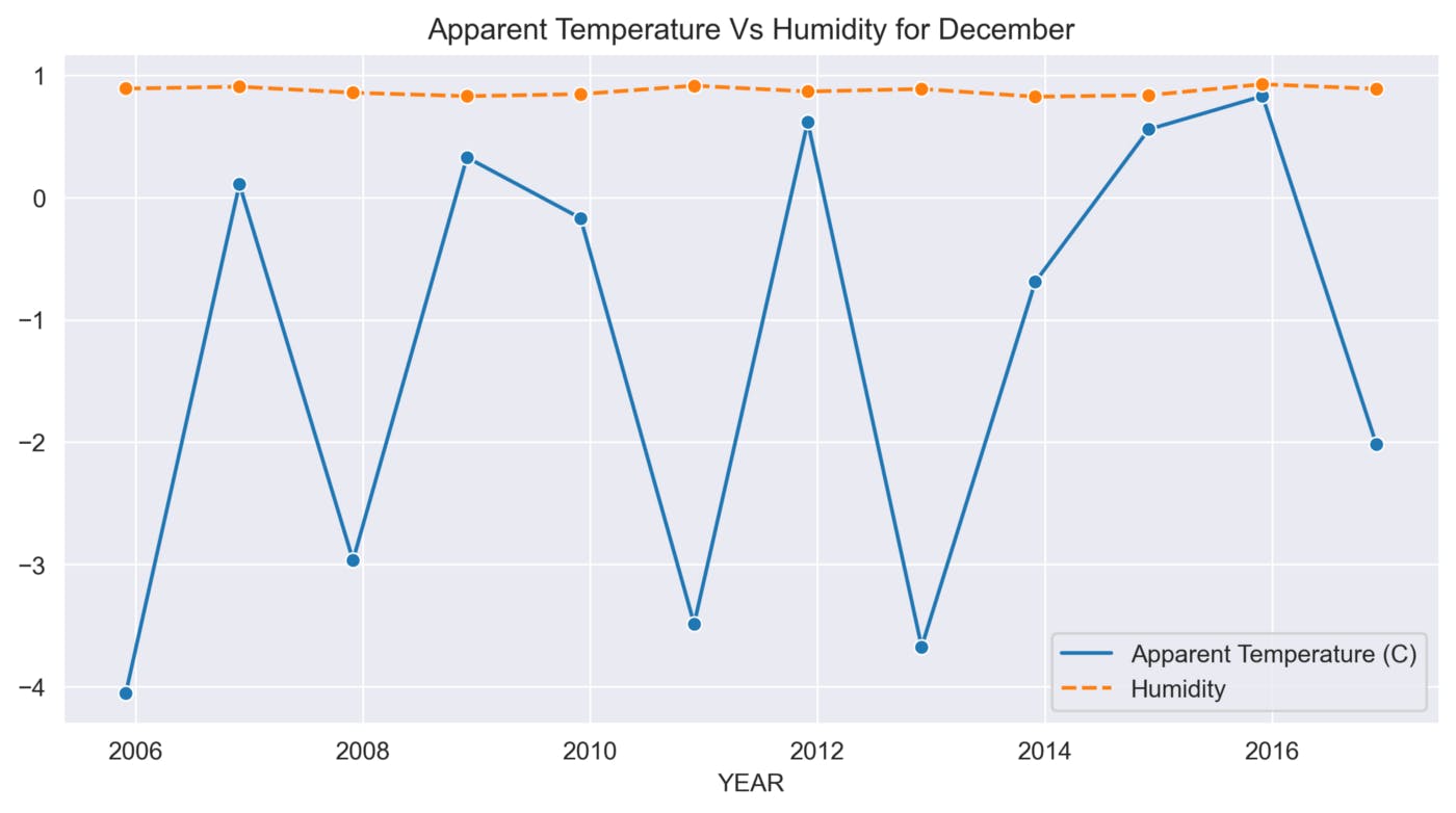
The above graphs show many ups and downs in the temperature and the average humidity has remained constant throughout the 10 years.
Conclusion
From this analysis, We can conclude that the Apparent temperature and humidity compared monthly across 10 years of the data indicate an increase due to Global warming.
I am thankful to mentors at internship.suvenconsultants.com for providing awesome problem statements and giving many of us a Coding Internship Experience. Thank you suvenconsultants.com